
The current Seattle School District online portal systems creates confusion and difficulty for students, parents, and teachers alike. The portals are spread across several interfaces, require keeping track of multiple logins, and generally are difficult to navigate. How might we create a streamlined, universal portal that students and parents can easily use for all their online learning needs.
Pathways solves this problem using a desktop and corresponding mobile app that allows for customization, accessibility, and has been tested and designed to ensure usability for parents and students alike.
UX/UI, UX Research, Wireframing, Prototyping, User Testing, Branding
12 Weeks | Sep 2021 - Dec 2021
2 - Theo Truong
System Analysis, User Interviews, User Research, Personas, Empathy Mapping, Flowchart, Wireframing, User Testing
Figma, Illustrator, Miro

Prior to conducting user interviews, we reviewed the current portal system in place in order to learn what function each portal serves, what tasks are completed in which portal, and how the portals connect to each other.


• Lack of hierarchy
• Too many steps to complete simple tasks
• Lack of organization in calendar
• Clunky navigation
• Opens too many new tabs to complete tasks
• Some links are more relevant than other depending on users
• What’s due isn’t always clear
• No notifications/announcements in one place
• Lack of options for customization
• Some sections lack clear labels and create confusion
Using our initial observations from analyzing the exisiting portals, we were able to create a survey sent out to parents, students, and teachers about their experiences using the current system, as well as create a set of questions to ask parents and students in user interviews to best identify pain points. This resulted in valuable insights that helped to create key goals for our redesign.
• Not centralized
• Difficult to navigate and tasks take too much time
• Too many clicks to get where you need to be
• New pages that open to complete certain tasks is frustrating and become difficult to manage
• Too many portals to keep track of
• Too many logins to keep track of
• Confusing overlap of information from different sources
• Inability to set priorities, save frequent tasks, and vary notifications
• Hard to figure out the best way to get in contact with each teacher
• Not easy for younger students, ESL, or technologically challenged
• Each portal has a different layout and with varying learning curves

“There are so many apps, portals, emails, and pages for parents to keep track of... I wish that they would make it easier to navigate to your specific school and frequent tasks.”
-SPS Parent
“Parents complain about the
portals ALL THE TIME. I had at
least 100 parents trying to
connect with me during Covid saying they didn't know how to use this or that.”
-SPS Teacher
“Generally all of the systems
suck. When my tech-savvy kids can’t figure out how to use the tool, it doesn’t make sense.”
-SPS Parent
Create options for personalization (to-do lists, save favorite tasks, customize dashboard to each parent and student’s unique needs).
Built in support for using the portal to take the responsibility off teachers, as well as a more streamlined communication system for students, parents, and teachers to connect and manage messages with ease.
Ensure information is centralized, and incorporate more recognizable design patterns for a better, more positive experience that users of all ages can understand.
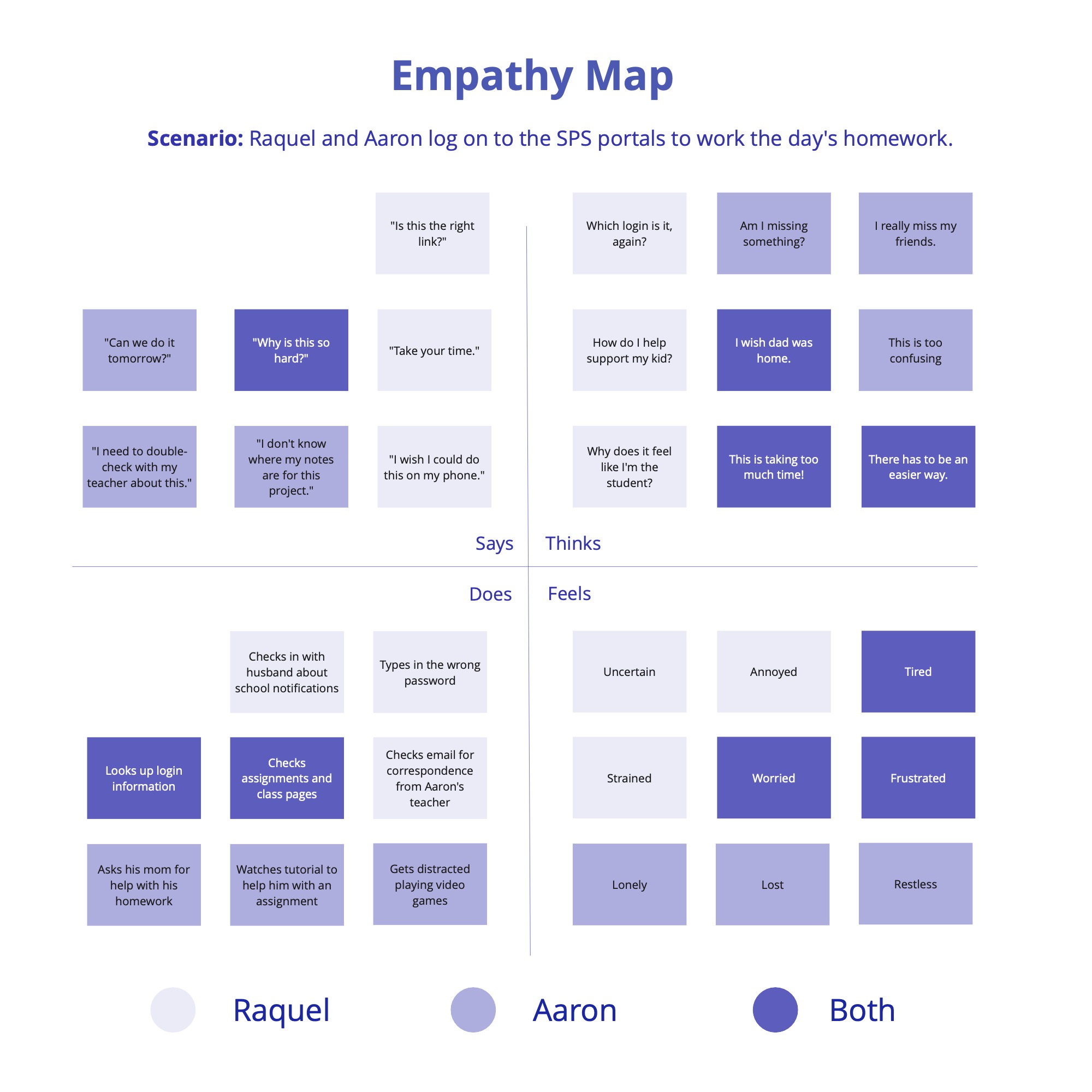
With the key goals and insights gained from our research phase, we were able to translate pertinent pain points and opportunities into a persona pair: a student and corresponding parent. Next, we created an empathy map and needs venn diagram based off these personas to depict their thoughts, feelings, and areas of overlapping need throughout their experience using the portal system.


To create a flow chart to reference when we get to wireframing, we first compiled a list of necessary tasks that our portal will need to address. We then organized tasks by student and parent, and created a system flowchart to serve as a visual guide in our next steps.

With our comprehensive flowchart created, we moved to wireframing the dashboard and thinking about customization features. We started thinking about the parent dashboard, and then moved to the student view.


Using both our flowchart and rough wireframe outline as starting points, we moved into creating a low-fi prototype and a series of user stories that best address some of our key goals for this redesign. We created user stories from both the student and parent perspectives to best empathize with the different types of users that would be interacting with this UI.
Aaron starts on his Pathway's homepage, and checks his class to-do list. He sees his most urgent task is his math homework, so he opens the worksheet in his class tab to start work on that assignment.
Aaron is working on his math worksheet and runs into a question he doesn't know how to solve. He first checks the class forum to see if anyone else has posted about it. They haven't, so he direct messages his teacher with his question. Once she responds with tips on how to solve the problem, he is able to finish and submit his assignment.
Raquel wants to book a counseling session for Aaron. She switches to her parent profile, and navigates over to Resources, and from there, opens the counseling tab. She selects an appointment with the counselor Aaron most recently saw, and chooses the earliest available date and time.
As our redesigned portal developed, we did several rounds of user testing to gain insights on edits we could make to ensure usability. We had three student test users, ages 13-15, a parent, and a teacher. The variety in user demographics helped us keep a range of perspectives in mind and kept our focuses on accessibility and inclusivity. Overall, the rounds of feedback helped us modify our design, reevaluate certain features to ensure clarity and reduce clutter, and create stronger hierarchy.
• Ability to minimize navigation
• Simplify homepage by most important for each user, and range widgets in size for more hierarchy
• Add "edit dashboard" option/icon to dashboard
• Make accessibility options (like translation and/or read aloud options) more prominent on home
• Make it quick to check recent grades on home
• Less color blocks overall to minimize distraction
• Create easier navigation from forums back to current assignment-- add a quick link button to get back to assignments from forum tab
• Indication that things have been submitted
• Adjust colors for certain elements for better contrast
• Adjust smallest text to be more accessible size
We landed on the name Pathways because we've combined several tasks and resources into one streamlined experience (so, parents and students have many “paths” to choose from). The name also felt filling as we’ve focused on developing options for customization in the portal to support personalized learning, growth, and connection.

The chosen primary color palette is a brighter take on the existing Seattle Public School blue, and the overall look and feel is meant to reflect trustworthiness, approachability, and a sense of calm.
Our logo represents both the idea of paths and growth through tree branches while staying abstract enough to be interpreted either way.

After establishing our brand, and completing several rounds of user testing, we moved to a high fidelity wireframe that reflects a clean UI that solves multiple problems our target users were facing with the existing portal system. We also expanded the web portal into a mobile app.
In addition to making Pathway's user experience accessible, we also sought to include options to be inclusive, such as creating themes that are friendly toward different types of color blindness, a clear and straightforward way to toggle to a different default language, and a way to activate text-to-speach.


With the final solution in place, we also worked to create a mobile-accessible app version of the interface. We created it from the parent point-of-view, but it could also support a joint student-parent account, or a solo student account. The app offers an even more convenient way to quickly pay a fine, check the bus, or complete a number of other tasks.
Pathways met the goals we set out early in the process. It offers options for customization to best serve each student and parent's unique needs, a streamlined communication system and way to access resources, and a centralized, simplified overall experience. As a team, we took the prototype through several rounds of user testing and refinements to come to a positive experience that users of all ages can understand.


