Despite what we're taught, I judge books by their covers. An effective book cover should quickly convey genre, tone, and encapsulate the story in a single image. As an avid collector myself, I also believe that a book cover is a piece of art that should make the reader excited to invest in a hard copy to display on their shelves. Scroll on to view a selection of recent book cover designs!
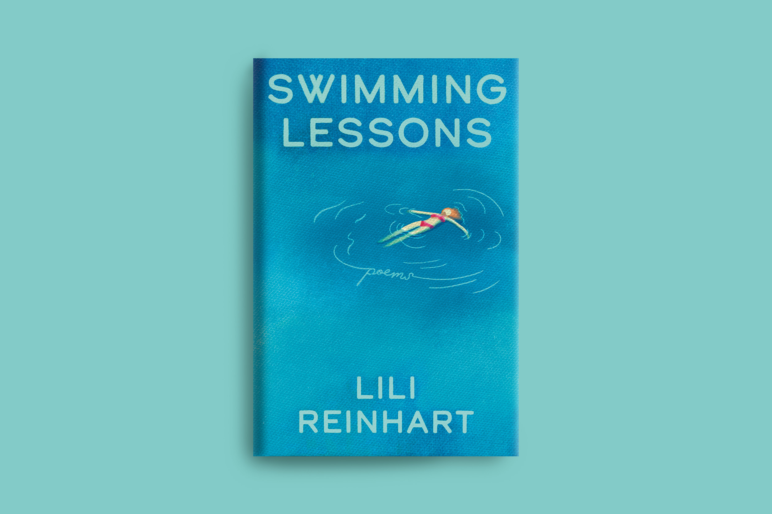
This poetry collection explores universal themes of anxiety, mental health, romantic relationships, and self-discovery, but the original cover's feminine aesthetic felt limiting given the book's broader emotional appeal. The goal of this redesign was to craft a more timeless, contemporary cover that could connect with a wider audience while still capturing the vulnerability and softness at the core of the piece.
The chosen cover direction serves as both a reference to the title and a metaphor for the ongoing process of healing and personal growth. A modern typographic treatment and subtle blend of light and dark blues help convey the emotional ebbs and flows explored throughout the poems, resulting in a cover that feels contemporary, reflective, and more widely accessible.
Graphic Designer, Illustrator
Self Initiated
Solo Project
Layout, Illustration, Typography
Photoshop, Illustrator, Procreate
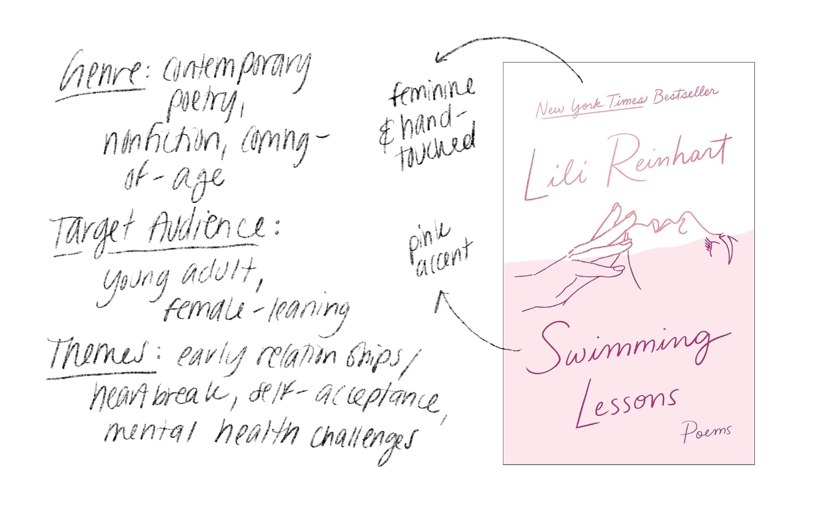
Research included an analysis of the book's themes and target audience, as well as a survey of the existing cover design. While the current cover successfully conveys vulnerability and softness, it also relies on overtly feminine illustrations, creating an opportunity for a more contemporary and broadly accessible approach.
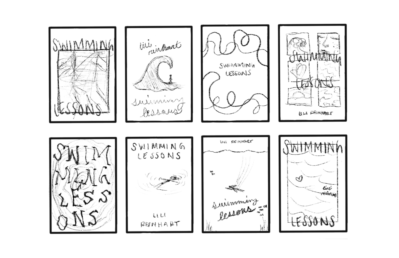
Pulling inspiration together, I found myself exploring water, distortion, and negative space as visual representations of mental health, self-discovery, and the often-isolating experience of growing up.
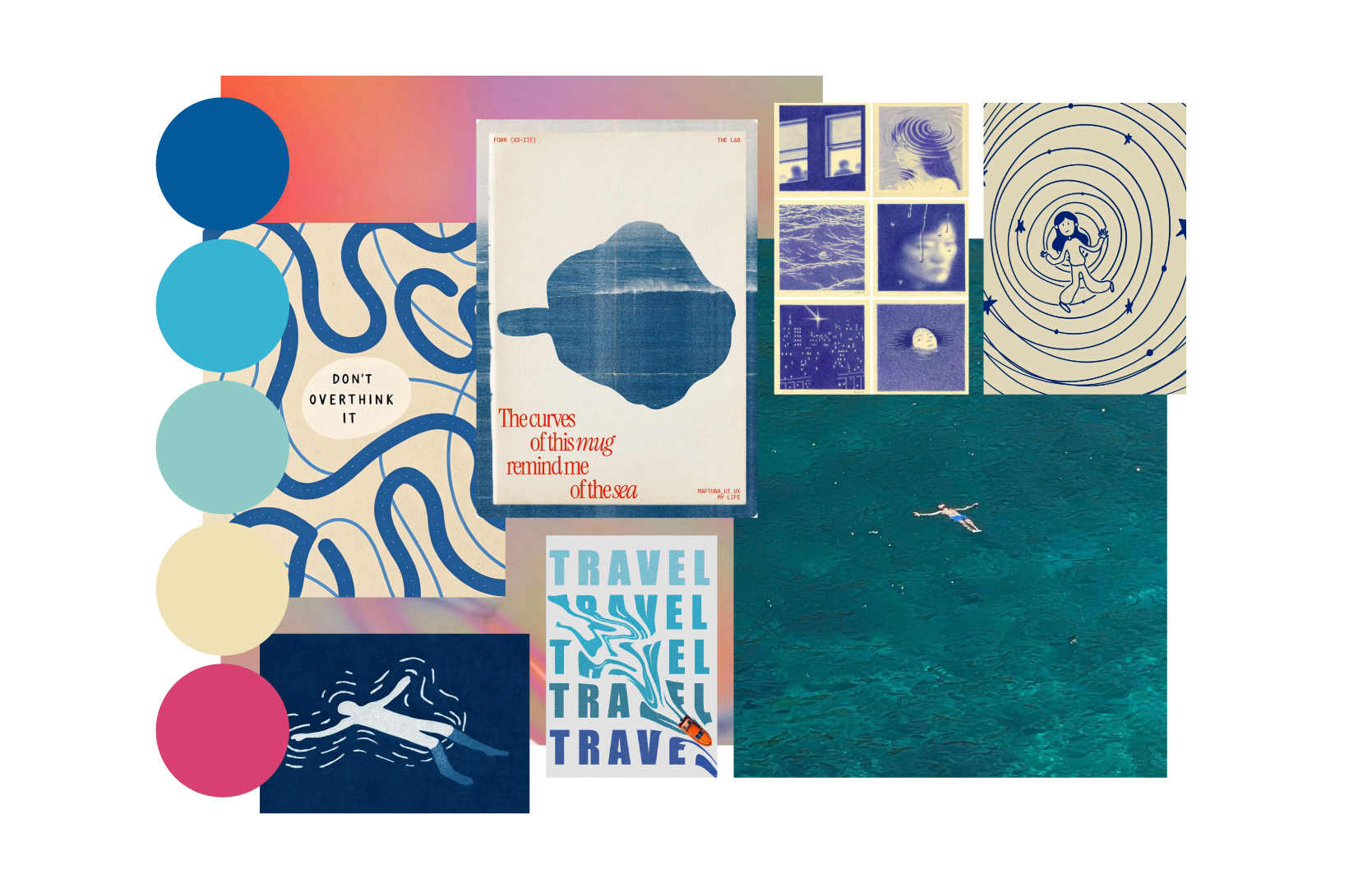
Through rapid sketching and ideation, I explored different ways to connect the book's themes of self-discovery and mental health to the concept of swimming and water.
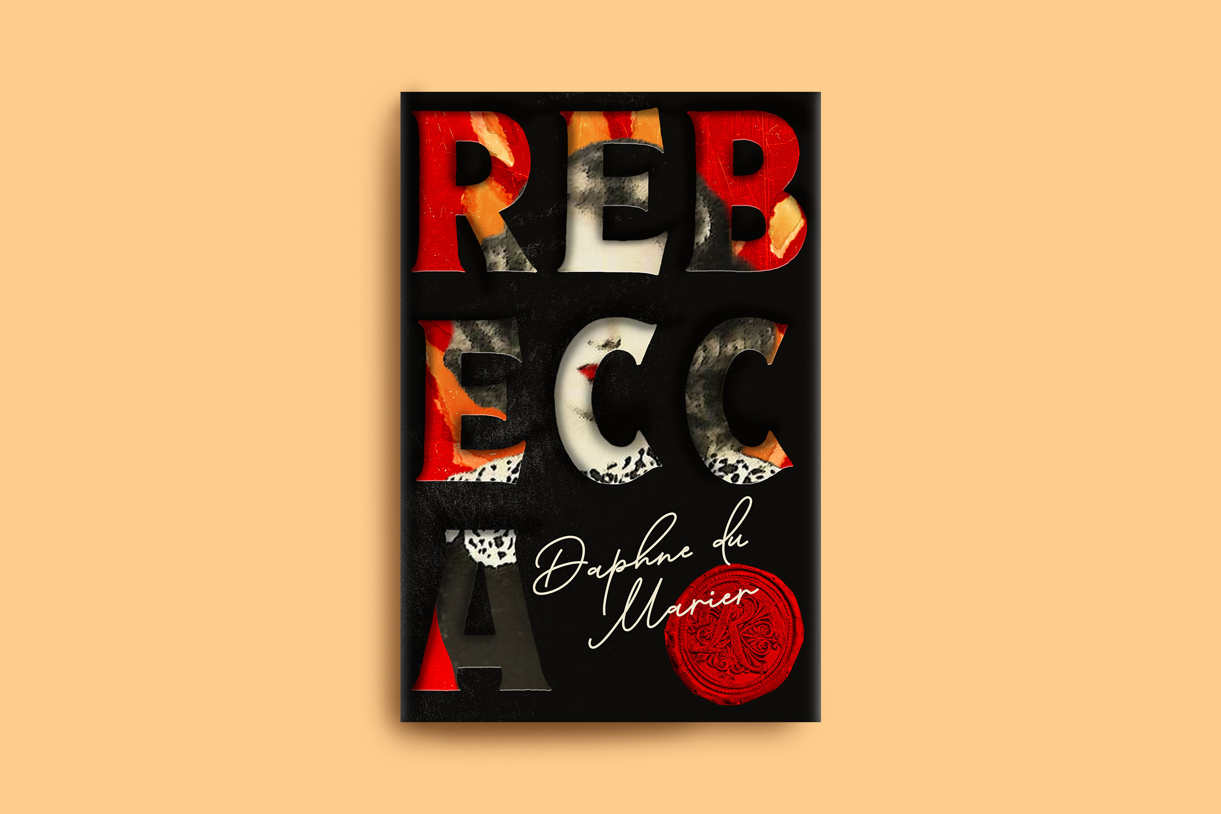
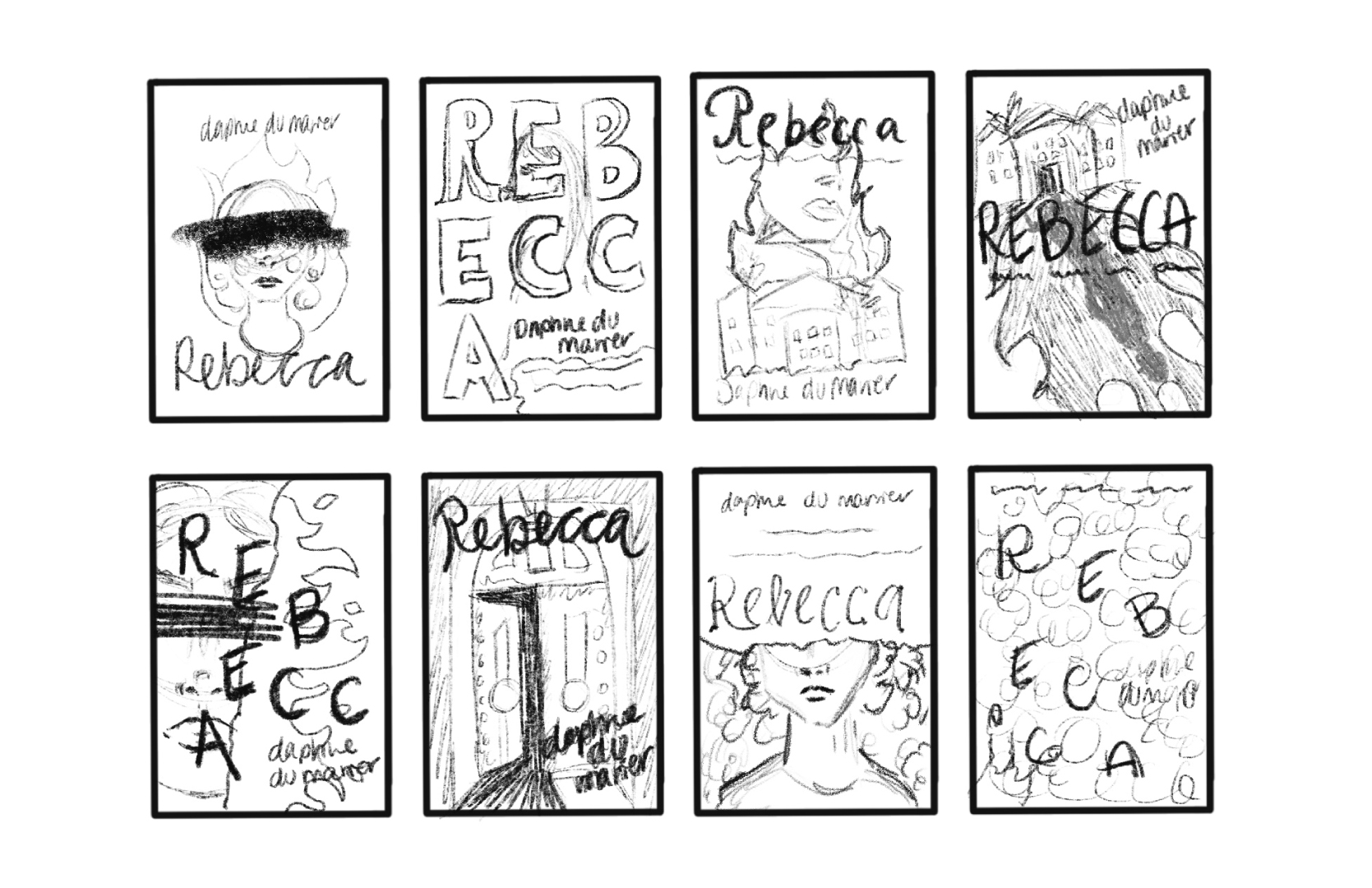
Many existing covers for Rebecca feel a bit dated and tend to focus on only one aspect of the story, whether the setting, romance, or mystery. The goal of this redesign was to create a more approachable cover for today's audience that also better represents the novel's unique blend of psychological suspense, gothic setting, and romantic intrigue.
Sharp, gothic-inspired typography reveals an anonymous, ghostly female figure with hidden eyes, representing both the unnamed narrator and Rebecca's unshakable presence. A limited color palette paired with textured flames alludes to Manderley's chilling fate, while also reflecting the psychological turmoil of the many characters living in Rebecca's shadow.
Graphic Designer, Illustrator
Self Initiated
Solo Project
Mixed Media Illustration, Typography, Layout
Photoshop, Illustrator, Procreate
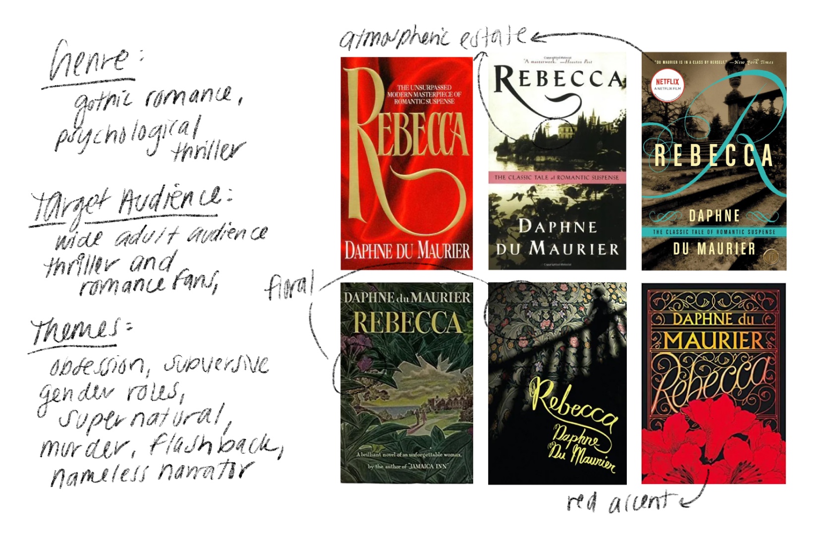
I began by identifying genre(s), audience, and themes around obsession, identity, and the subversion of gender roles. In my survey of existing cover designs, I found the use of atmospheric imagery, floral motifs, and red accents inspiring, but also saw opportunities for a more contemporary interpretation, especially in the type treatments.
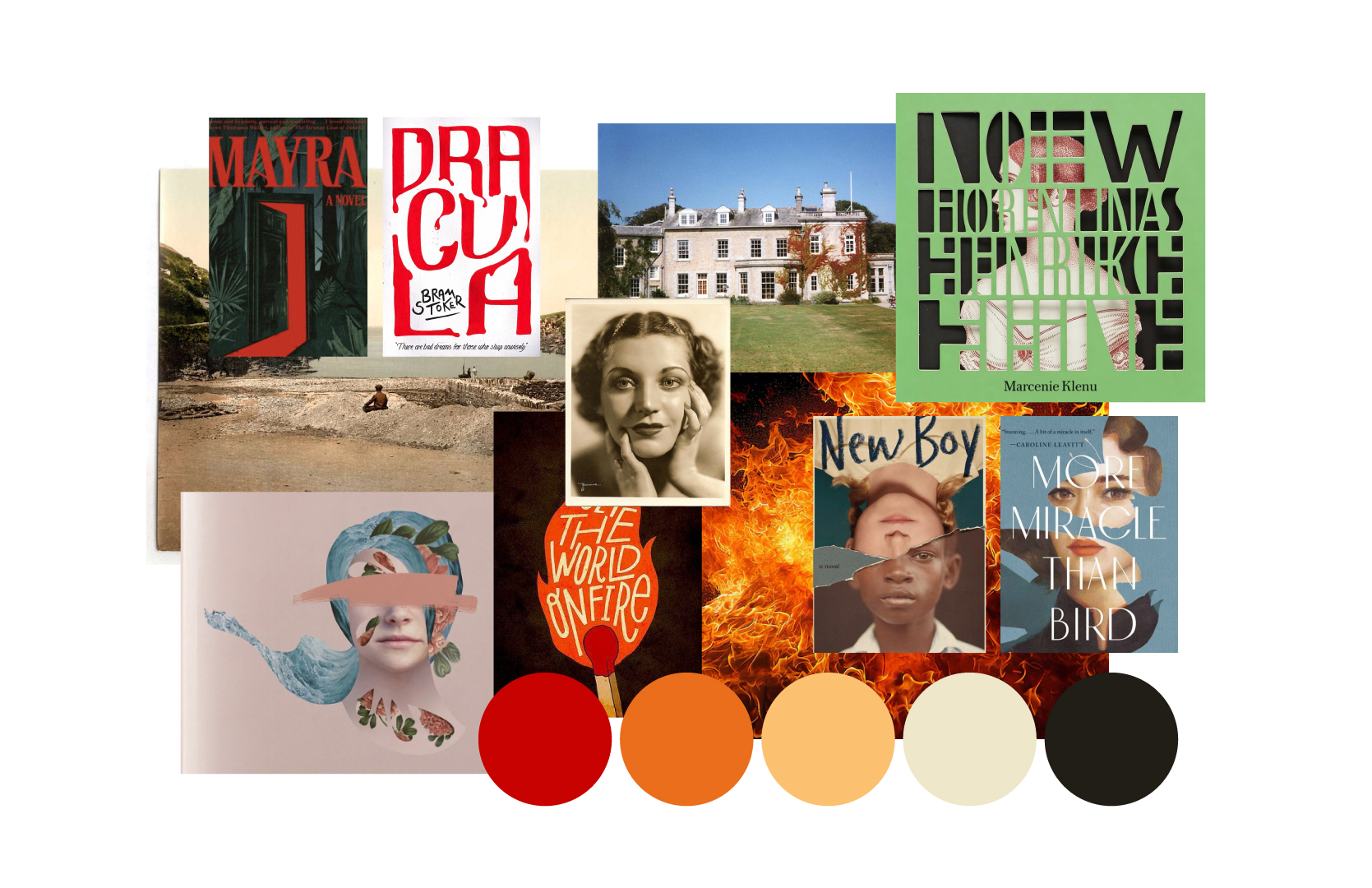
My moodboard for Rebecca explores more abstract ideas like anonymity and obsuration, and more literal references like vintage photography and gothic architecture. I ultimately found myself very inspired by dramatic typography, limited color palettes, vintage portraiture, and depth in composition.
Early concepts explored the relationship between typography and image, how to depict Rebecca's presence, and how distortion could help represent anonymity (while creating tension, suspense, and a spooky vibe).

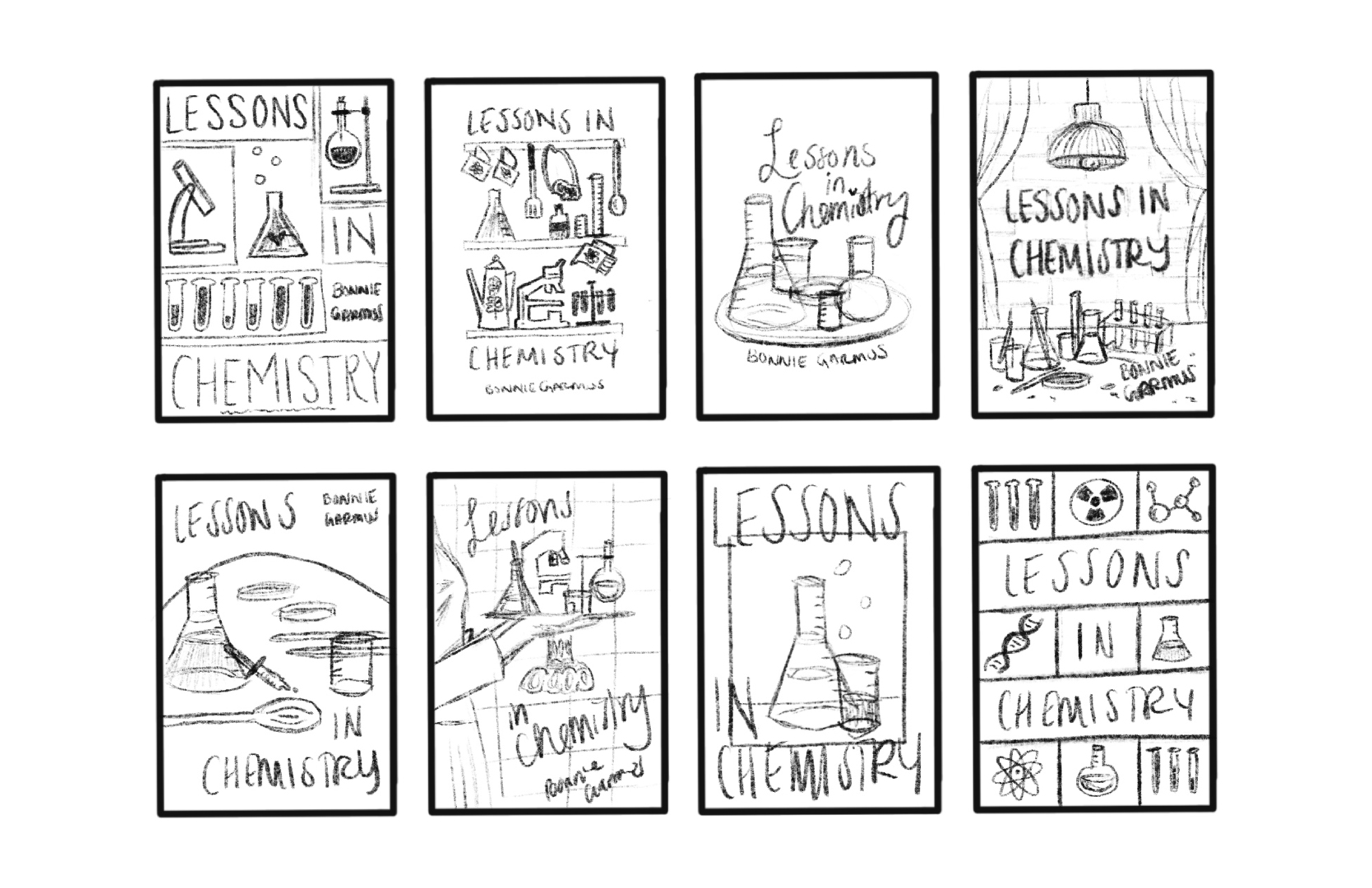
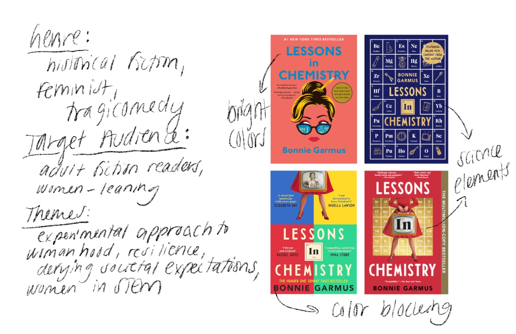
Despite its popularity, Lessons in Chemistry has been mistaken by many (myself included!) for a light romance due to its bright pink, playful cover design. This redesign aimed to create a cover that more accurately reflects the novel's combination of historical fiction, feminism, humor, and appeal to readers who might otherwise overlook its deeper themes.
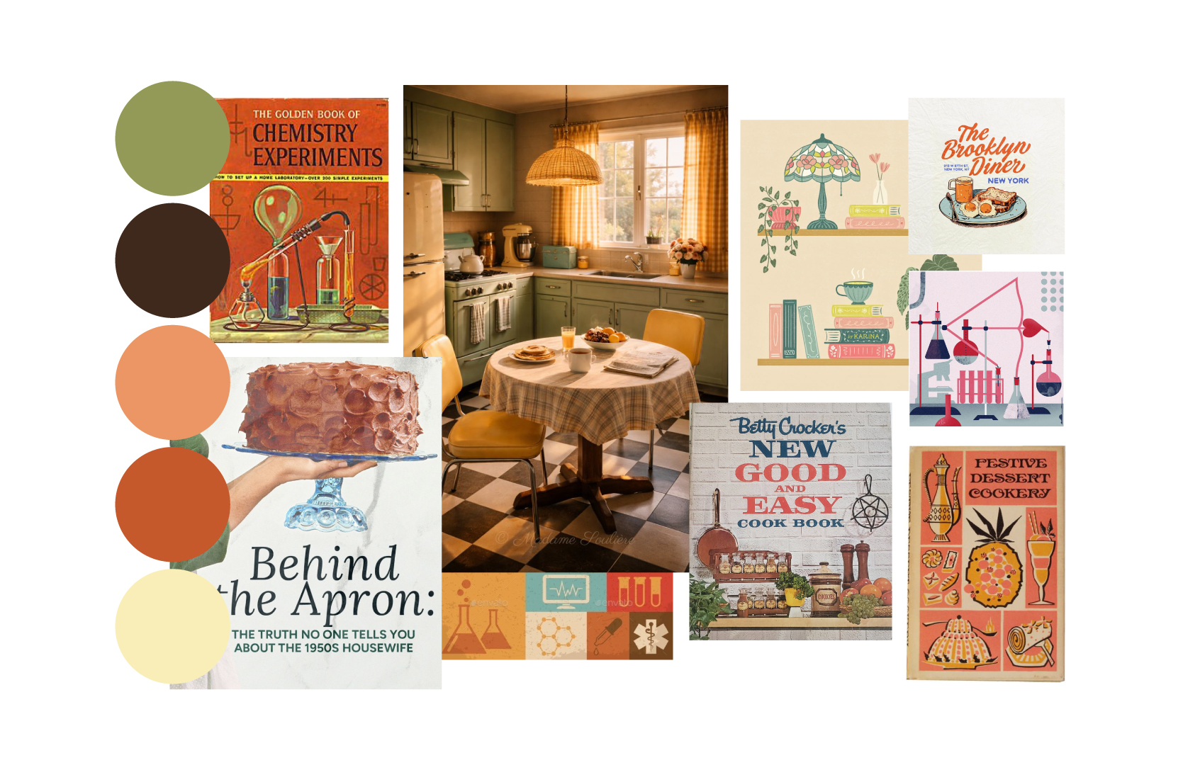
I drew inspiration from the novel's 1950s setting, illustrating vintage kitchen shelves filled with both cookware and chemistry equipment. The juxtaposition reflects the protagonist's role as both a television cooking show host and scientist, while also highlighting the "domestic" gender expectations of the time period that she continually challenges.
Graphic Designer, Illustrator
Self-Initiated
Solo Project
Illustration, Typography, Layout
Photoshop, Illustrator, Procreate
I began by researching the novel's genre, target audience, and themes of gender inequality, resilience, ambition, and self-determination. Through my survey of existing covers, I found a strong emphasis on bright colors and the periodic table and saw an opportunity to better communicate the book's historical setting and feminist perspective.
Much of my inspiration centered around 1950s-60s kitchens, vintage chemistry textbooks, and cookbooks (since the novel involves both a cooking show, and chemistry tests conducted in the protagonist's kitchen).
Through my sketching brainstorm process, I was especially excited to create someting that felt representative of the time period the book was set in. I crafted interpretations of the vintage cookbooks from my moodboard, while playing off the deeper theme of subverting gender roles by combining delicate illustrations with heavy-duty chemistry tools.