Working at Smosh, I've had the opportunity to work on several merch campaigns that are based around different shows, channels, characters, and special events. Merch design is one of my favorite forms of storytelling. My process combines a deep understanding of the Smosh brand and audience, a strong eye for composition and typography, and a knack for creating some fun and zany concepts (that have a proven track record of selling out, woo!).
Scroll on to see a selection of my favorite projects.

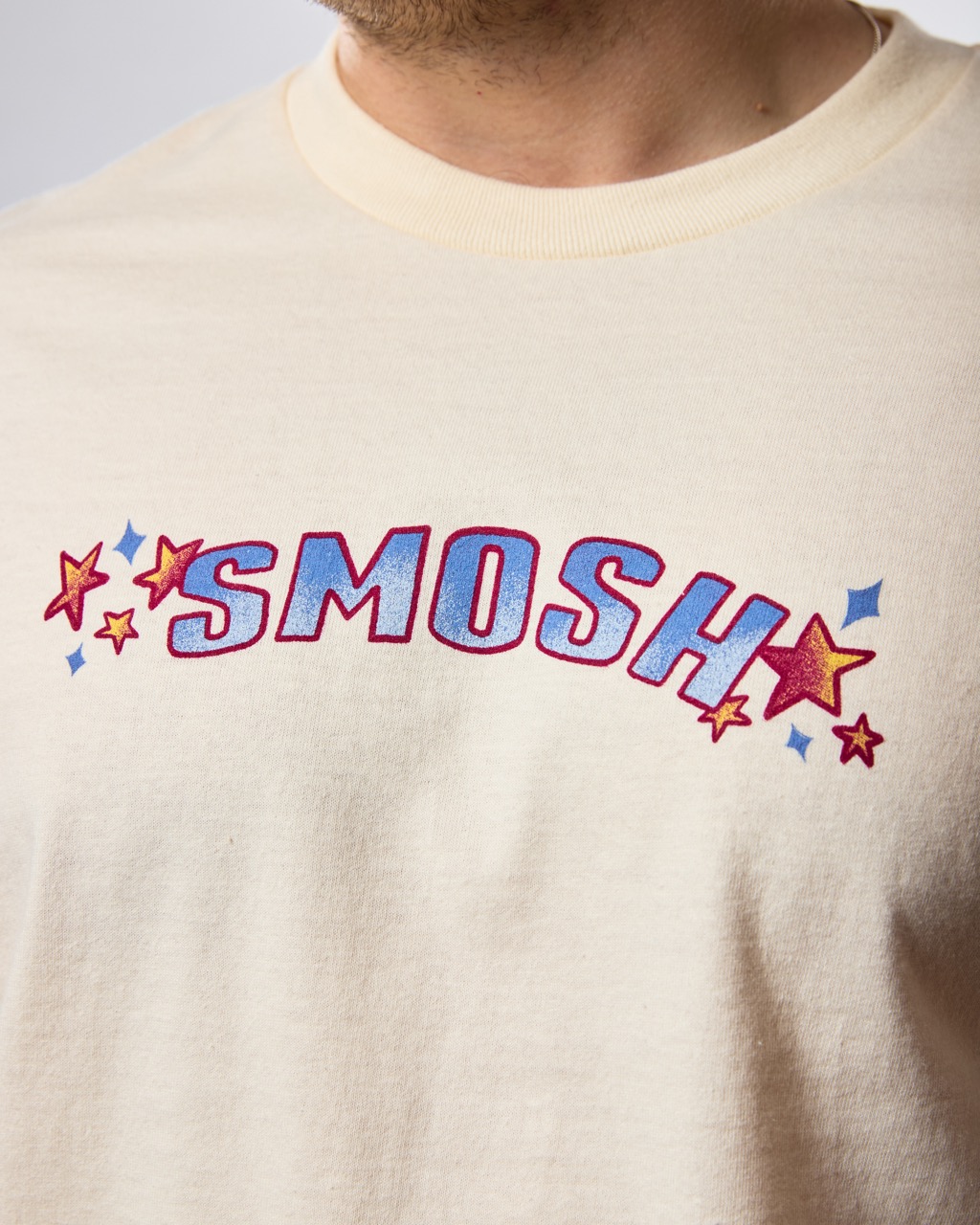
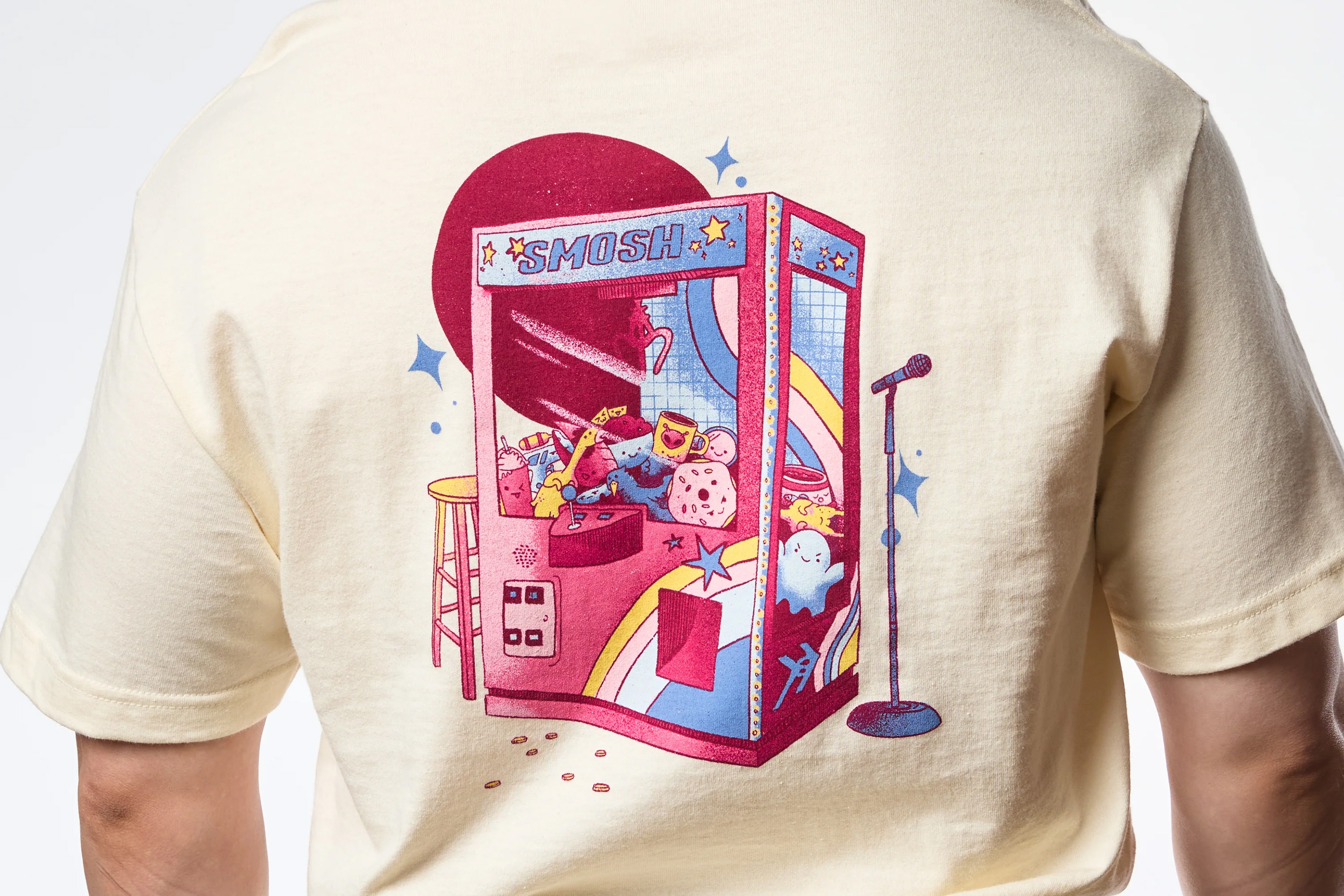
Design a merch line that generally represents the Smosh Pit channel, including it's various shows, characters, and cast members.
The concept for this line started around creating a cutesy pattern that would translate well on a water bottle (since the release was planned for the summertime). I started sketching around different inside jokes and references that would create some fun Easter eggs for Smosh fans. Once I had a collection of items, all personified with simple smiley faces and expressions, I started to think: "what if these were all plushies in a 'Smosh Pit' claw machine." The rest came easily. The bright color palette and handtouched, illustrative direction for the shirt felt like the strongest way to capture Smosh Pit's authentic, fun, and slightly chaotic spirit.
Graphic Designer, Illustrator
Smosh Productions
Brittany Hobbs - Design Director
Mallory Myers - Merch Manager
Illustration, Layout, Print Design
Procreate, Illustrator, Photoshop

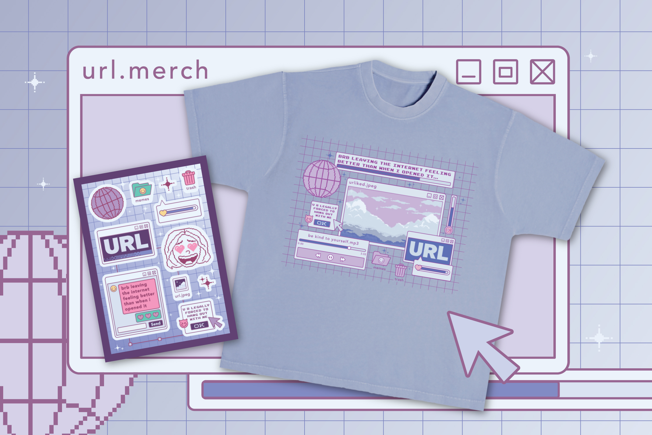
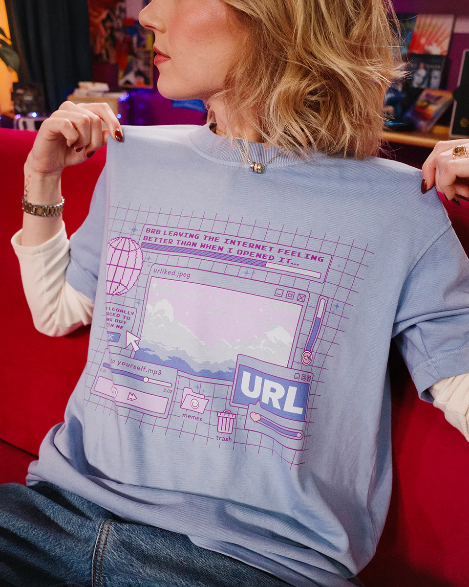
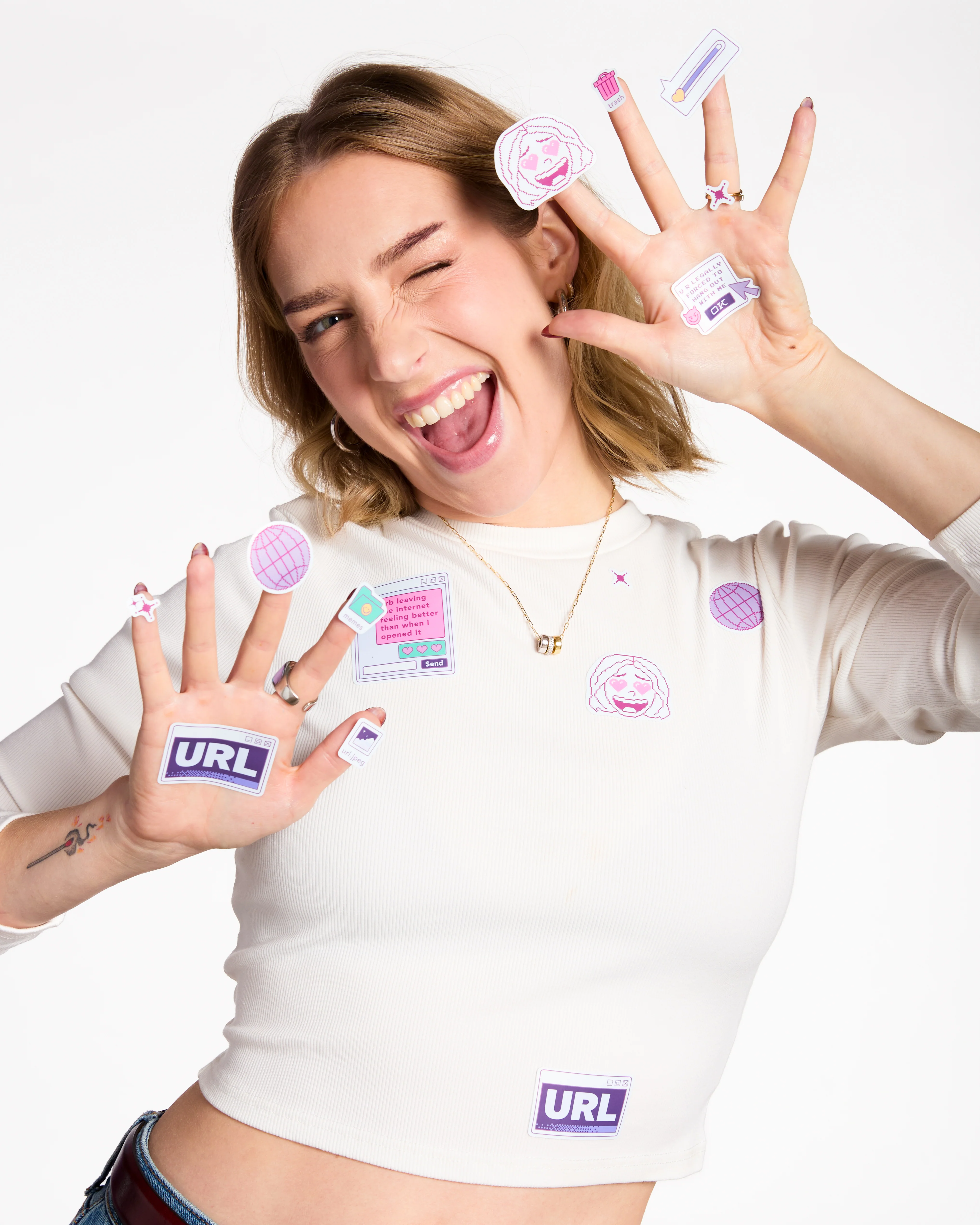
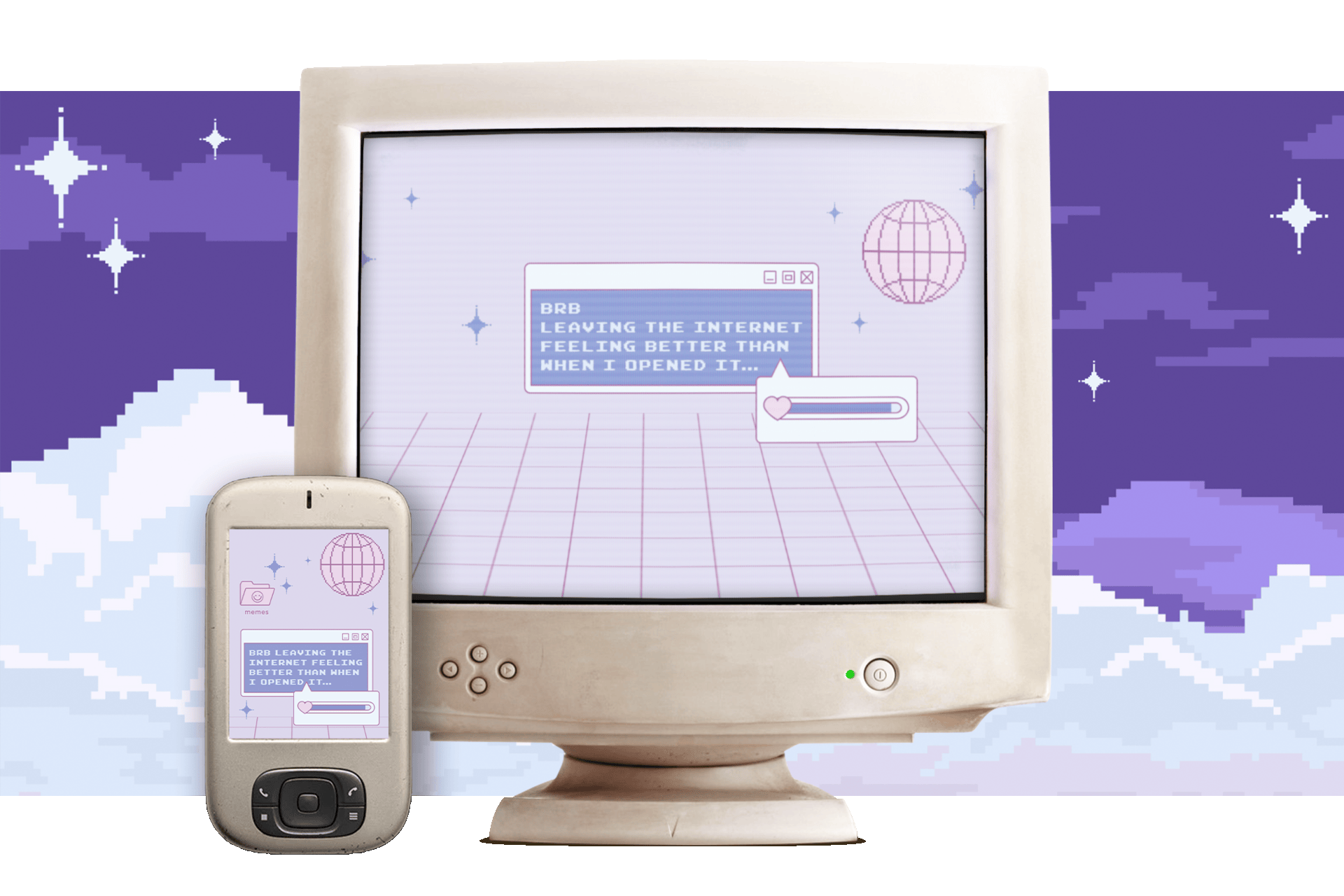
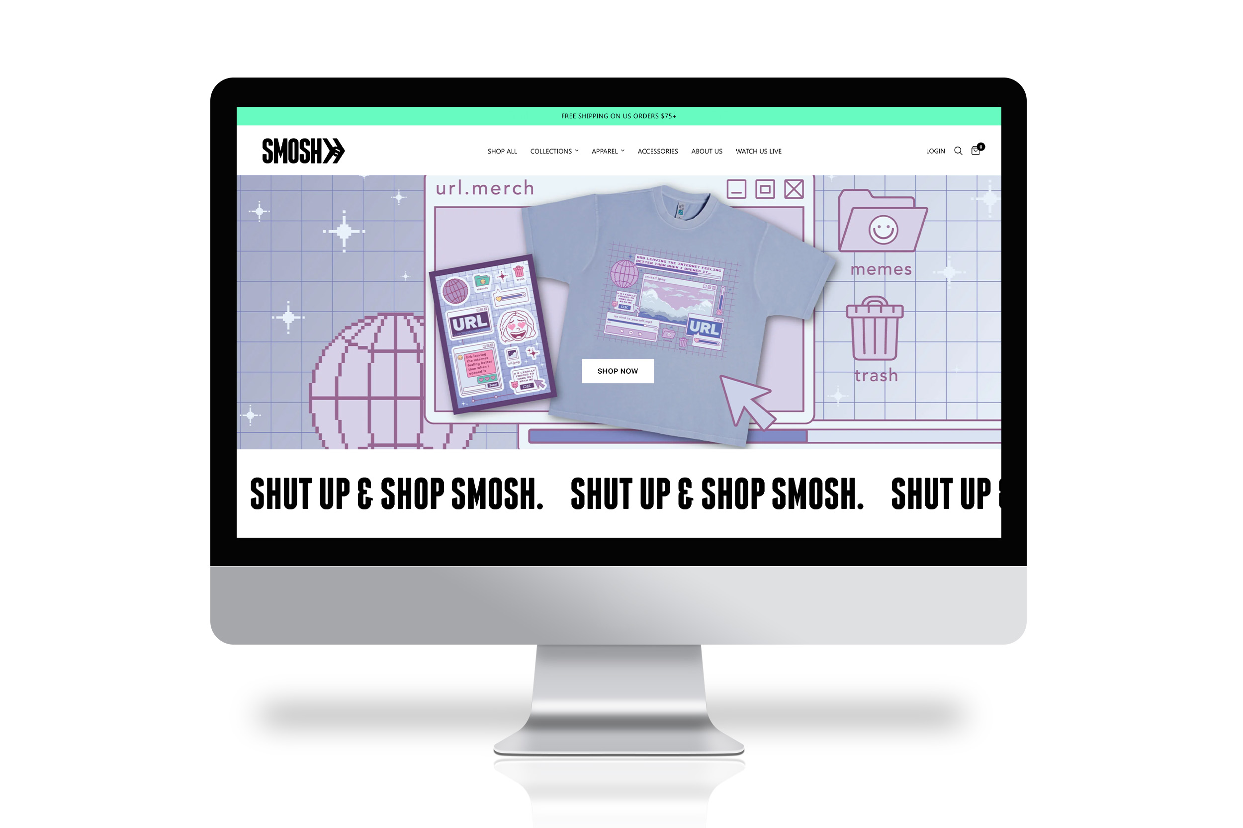
Create a collection to help kick-off a new podcast called URL, which is themed around the ideas of exploring people's relationships to the internet and bringing more positivity online. The goal is to help the audience "leave the internet feeling better than when you opened it."
Early in concepting, I knew we wanted to create a shirt that would compliment and coexist with the Y2K aesthetic of the podcast's set. With this in mind, I set off researching and found inspiration in retro desktop computers and a "lofi chill," relaxed color palette. The result is a nostalgic interpretation of an old desktop, complete with pastels, positive messaging, and tranquil pixel art. The accompanying sticker set is a bright counterpart to the shirt, intended to be an interactive experience where audiences can layer and arrange the stickers to create their own desktop layouts with the various folders, windows, and graphic elements.
Graphic Designer
Smosh Productions
Brittany Hobbs - Design Director
Mallory Myers - Merch Manager
Illustration, Layout, Print Design
Illustrator, Photoshop

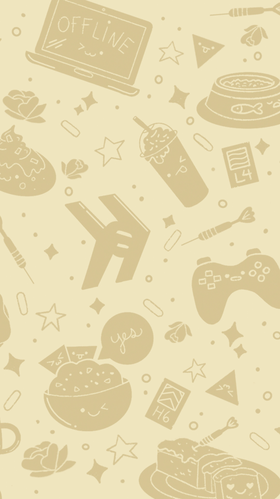
In the spirit of bringing more positivity to the internet, the team wanted to have some free, downloadable assets to offer anyone who purchased URL merch. I designed a set of mobile and desktop wallpapers that live in the same brand feel as the merch.

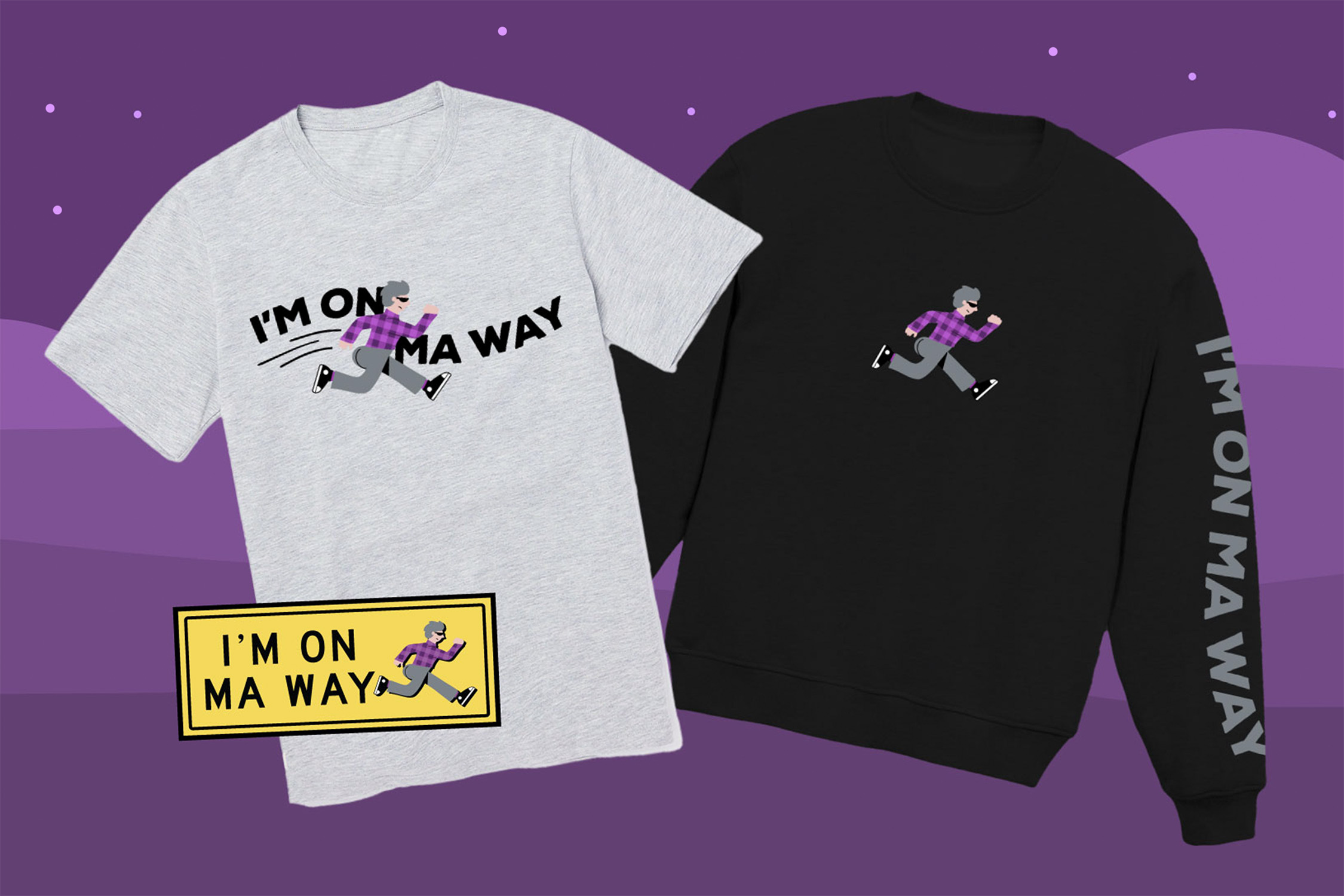
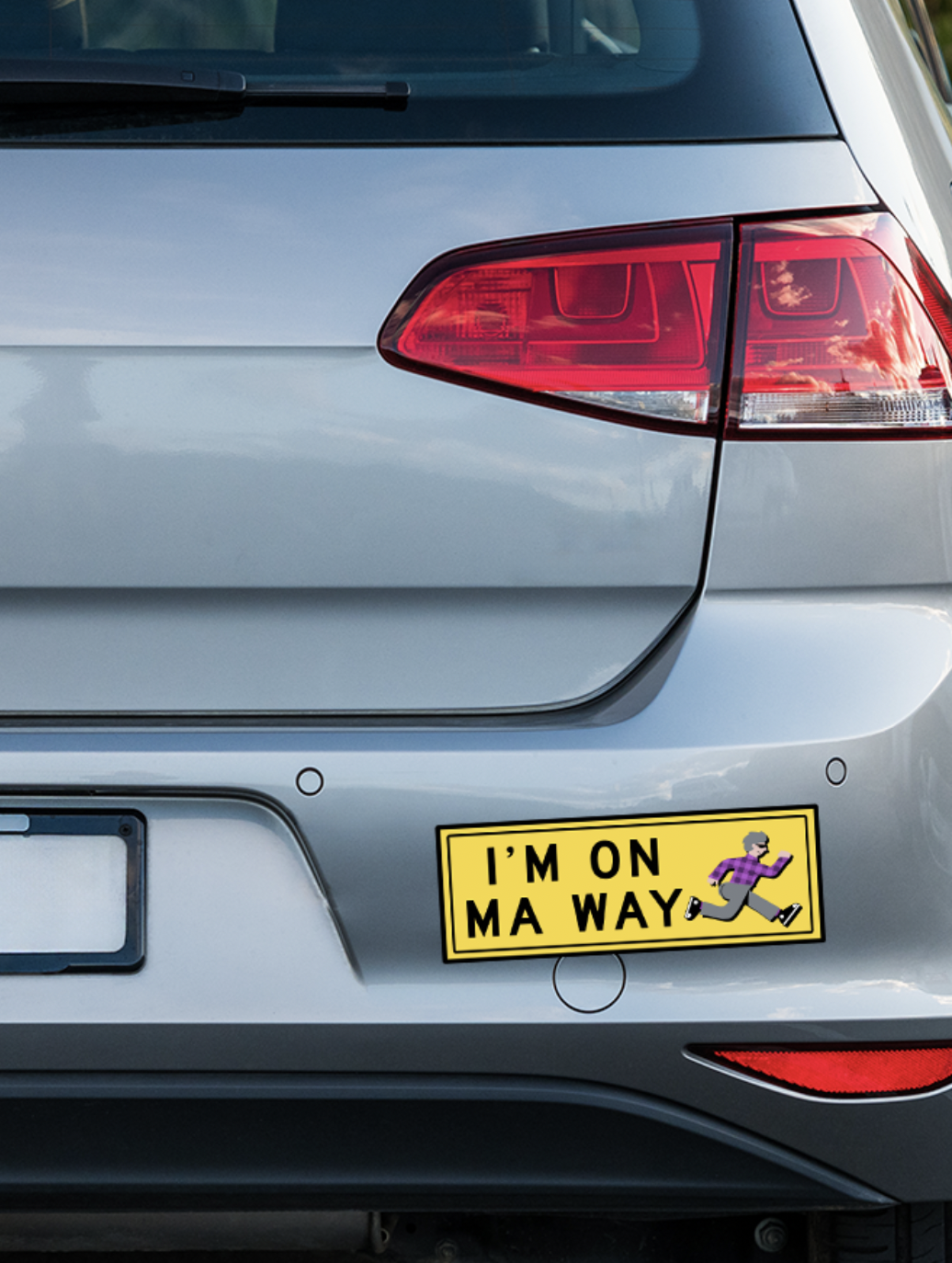
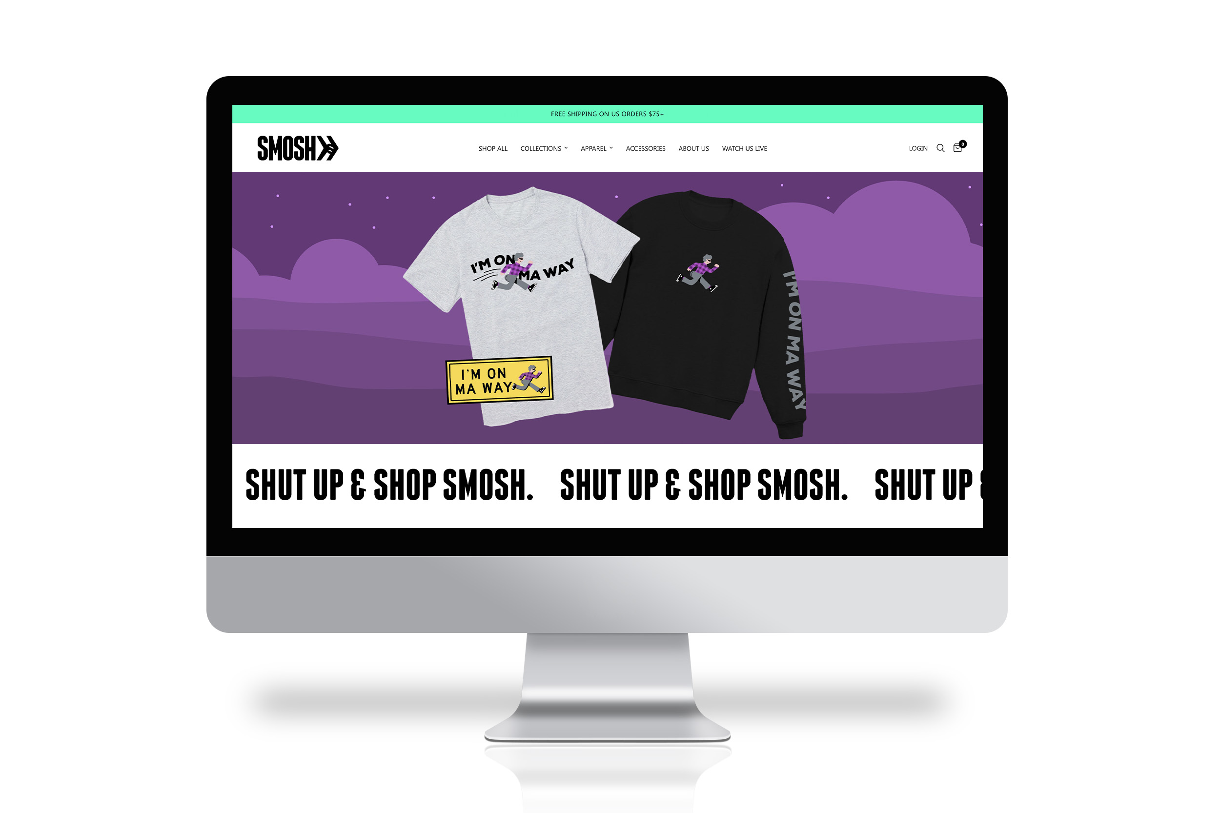
Design a merch line based around a beloved character, Gerald Cakes, who is known for his serious demeanor, oversized butt, and catchphrase: "I'm on ma way."
Inspired by our always-in-motion character, I originally drew inspiration from traffic signage. The team knew the line would translate well for a bumper sticker, and the idea to make it look like a classic "crossing" sign stuck from the beginning. Then, of course, came the challenge of creating a character design that captures Gerald Cakes' rigid posture while in motion. Wavy yet structured type compliments his angular run and helps highlight the idea of speed. The overall result is a line that captures the over-the-top character's personality and catchphrase in a fun and wearable way, making the line appealing even if you're not familiar with the character.
Graphic Designer, Illustrator
Smosh Productions
Brittany Hobbs - Design Director
Mallory Myers - Merch Manager
Illustration, Motion Design
Procreate, Illustrator, After Effects


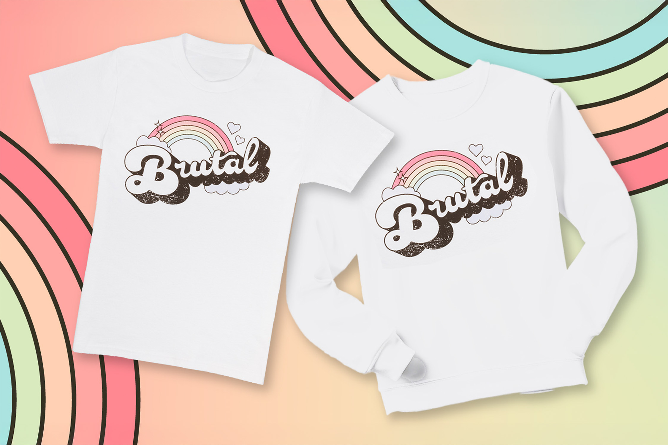
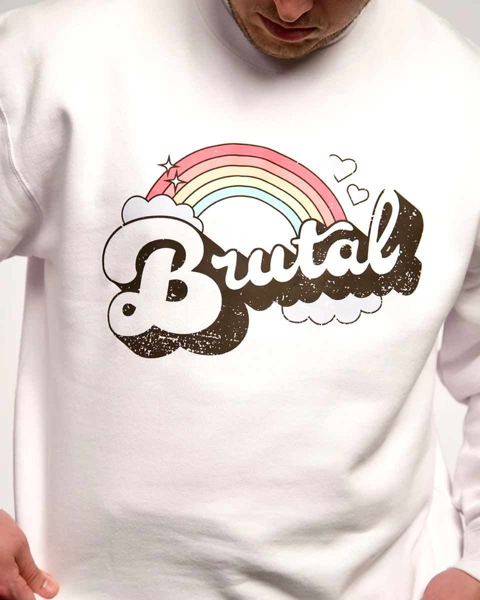
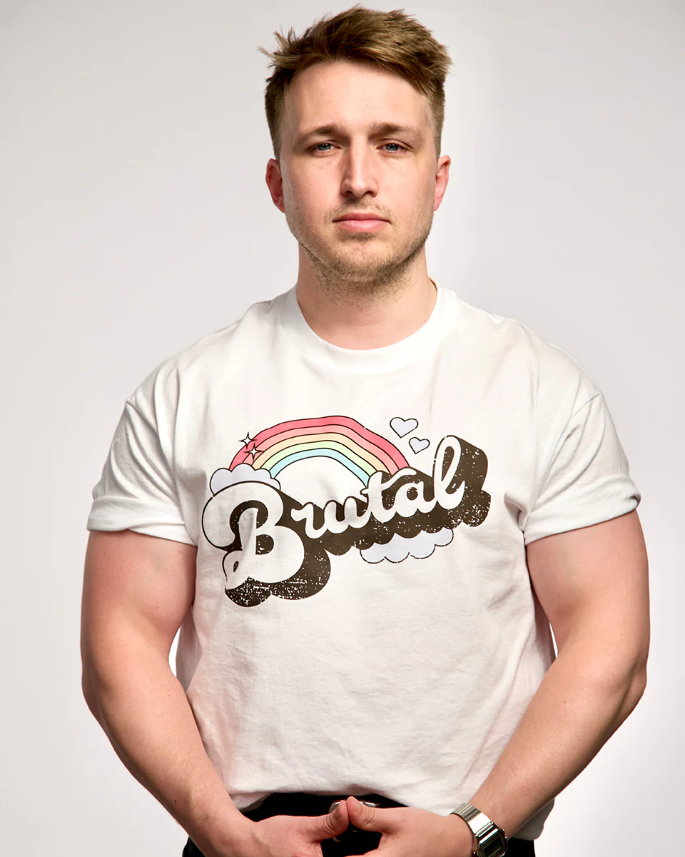
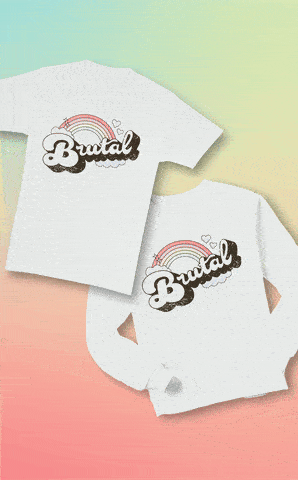
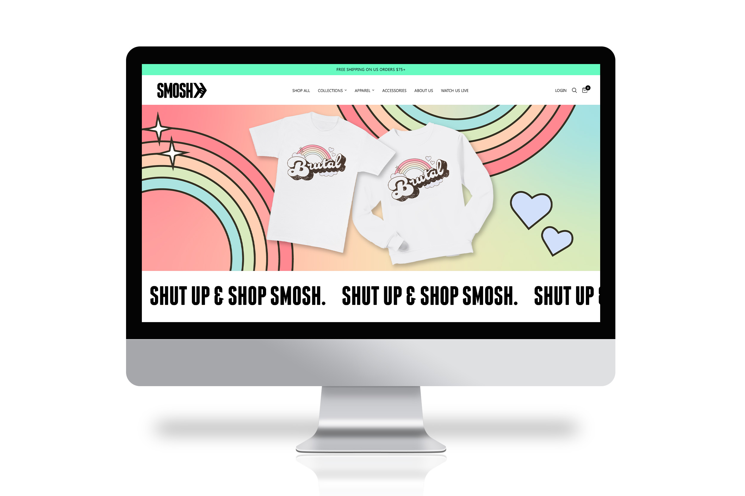
Create a design representing a key cast member's commonly-said phrase: "brutal."
From early meetings, we knew we wanted to play with the juxtaposition of the word "brutal" with cutesy, Carebear-like imagery. We went through lots of iterations on how to best pair rainbows and hearts with a whimsical type treatment. After learning about Shayne's love of vintage t-shirts, I landed on a retro typeface as a base and customized from there, combining the rainbow, hearts, and soft, bubbly typography with a gritty texture overlay that both accentuates the juxtaposition and results in a t-shirt that almost looks like a gem from a thrift store. It continues to be one of Smosh's best-selling merch items!
Graphic Designer
Smosh Produtions
Brittany Hobbs - Design Director
Mallory Myers - Merch Manager
Layout, Print Design, Motion
Photoshop, Illustrator, Afer Effects