
Build a visual identity in celebration of Smosh's 20 years on the internet that can serve as branding for the anniversary party as well as a social media campaign that helps the audience celebrate, too.
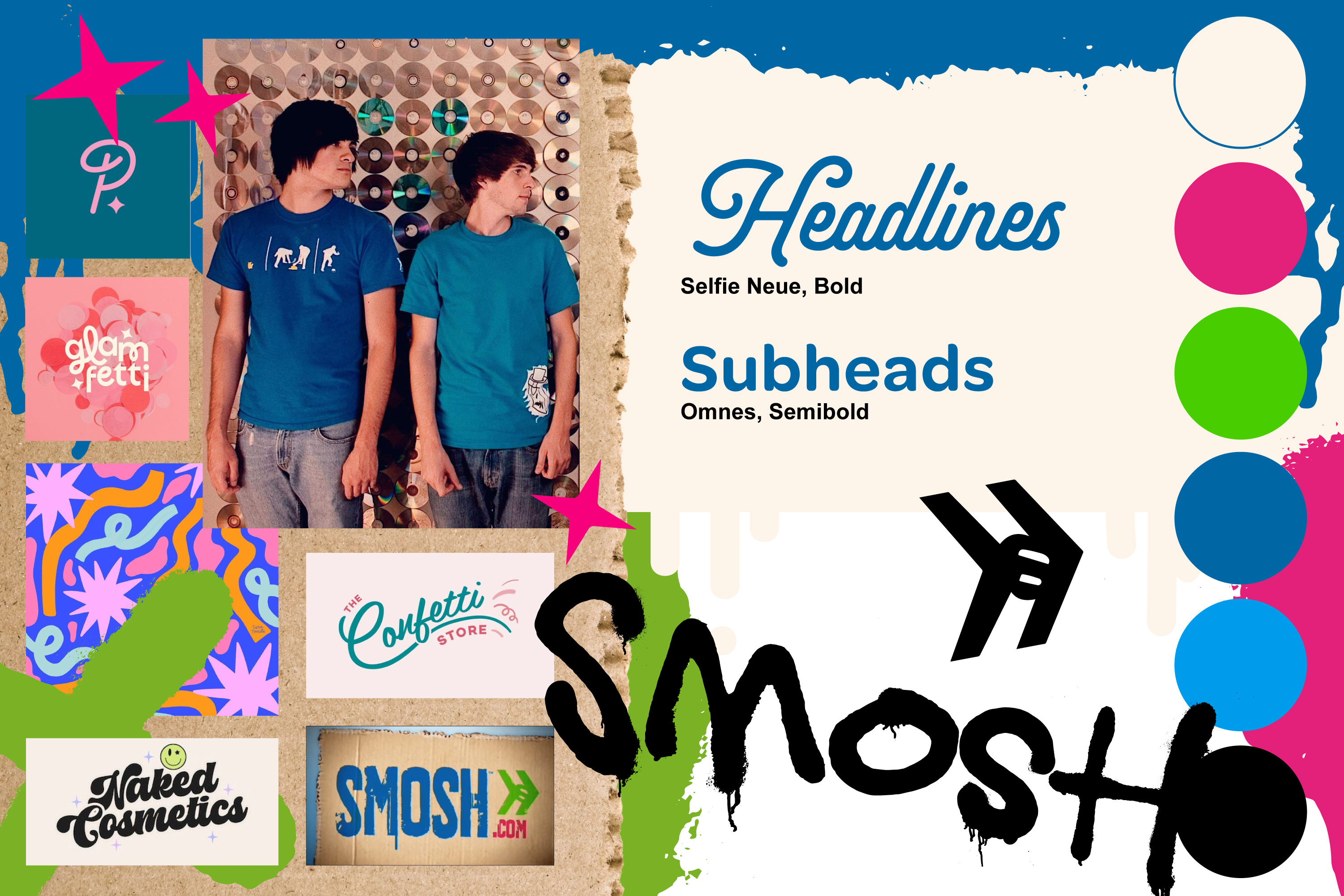
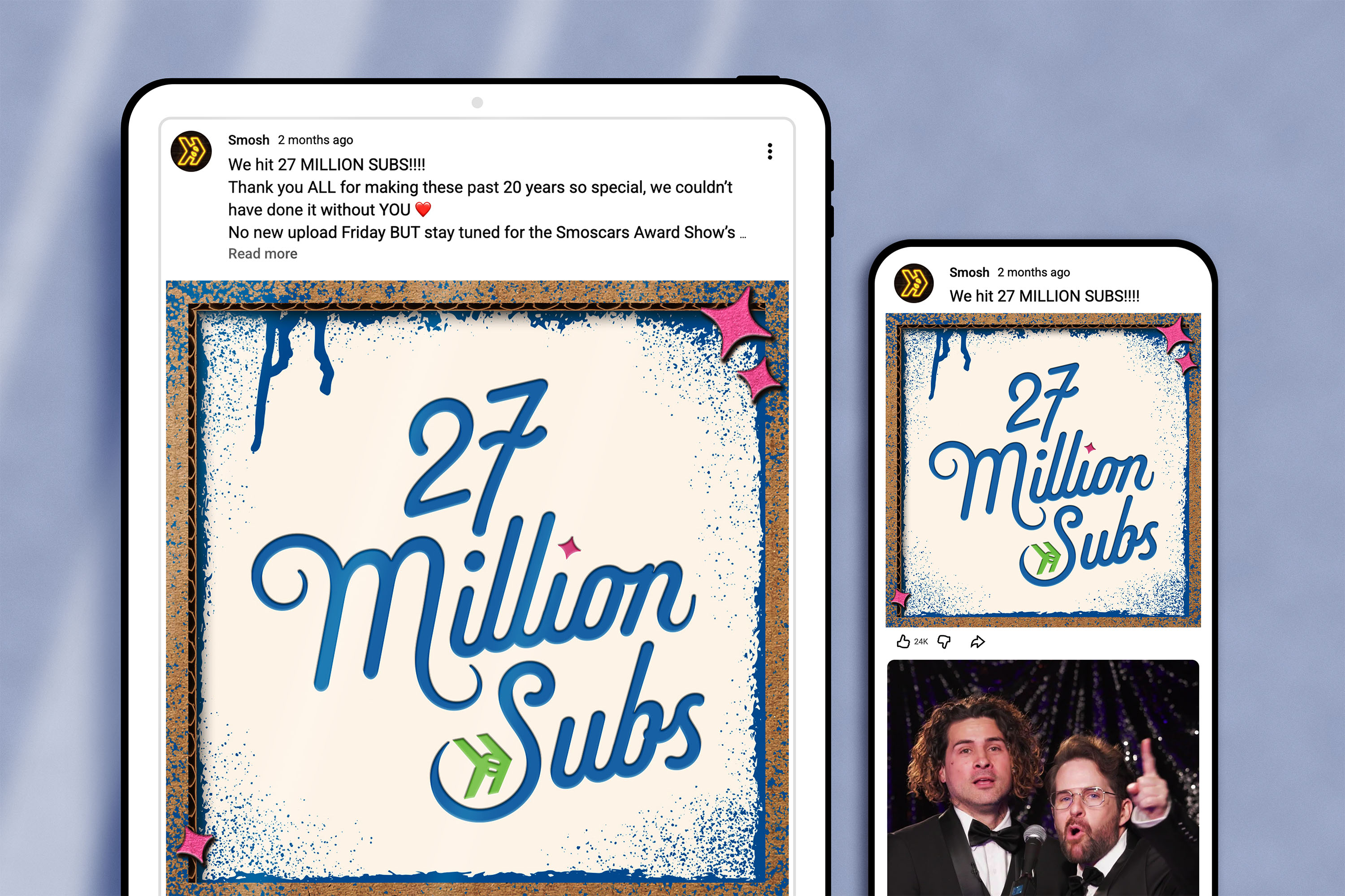
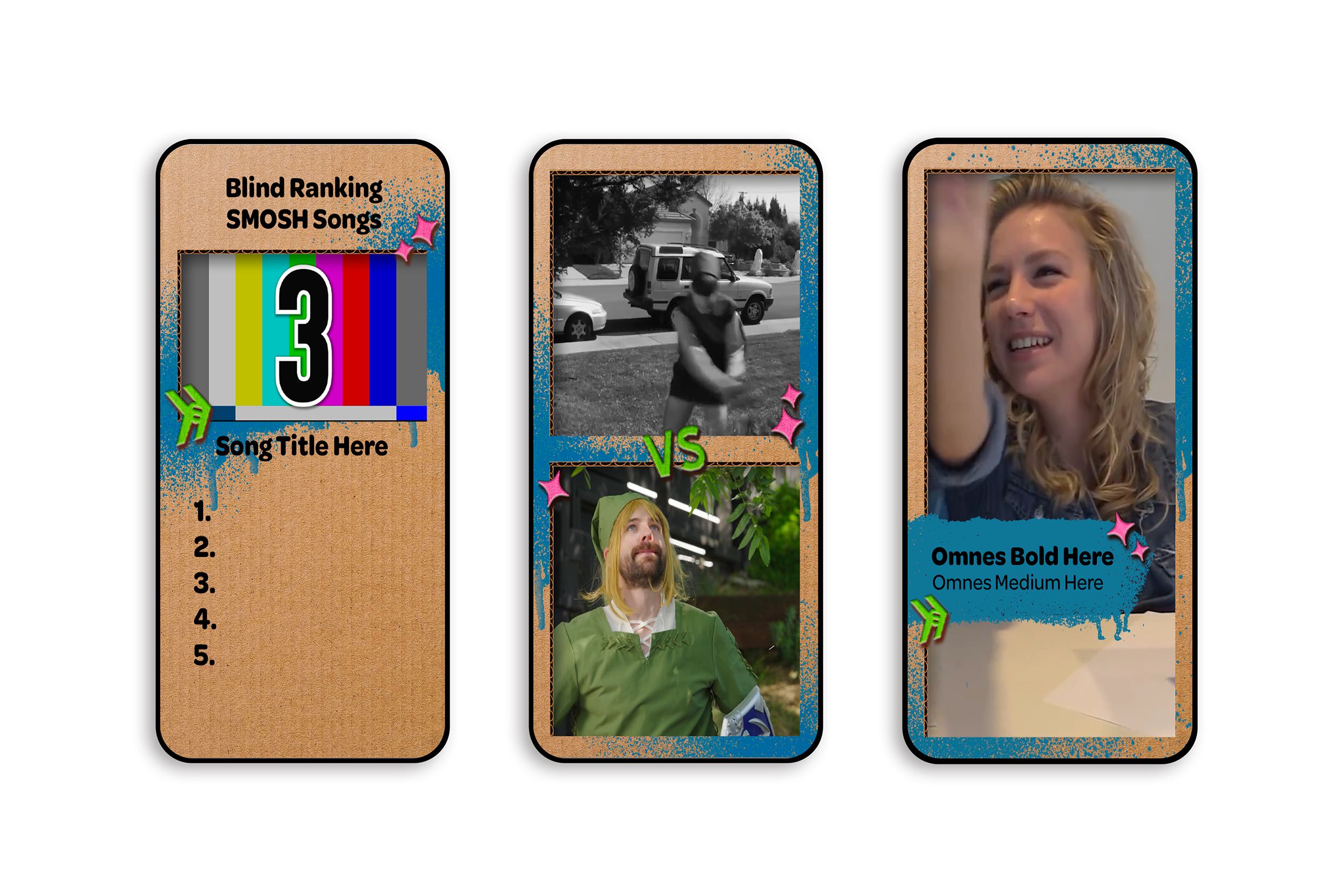
The design direction off the bat was to combine "old Smosh" with "new Smosh." I was heavily inspired by Smosh's original color palette, graffiti and drippy paint textures, and cardboard backgrounds. With this recipe in mind, I strived to create a brand that had all the elements of "old Smosh," but elevated to result in a classy, modern twist that still packs a nostalgic punch.
Graphic Designer
Smosh Productions
Brittany Hobbs - Design Director
Branding, Layout, Print Design
InDesign, Photoshop, Illustrator
Early research started with surveying a lot of Smosh's oldest, iconic moments, "sets," and brand directions. It was a fun challenge to test out different ways to breathe new life into the drippy paint and cardboard approach, while incorporating those elements in a intentional way that feels elegant and representative of 20 years.
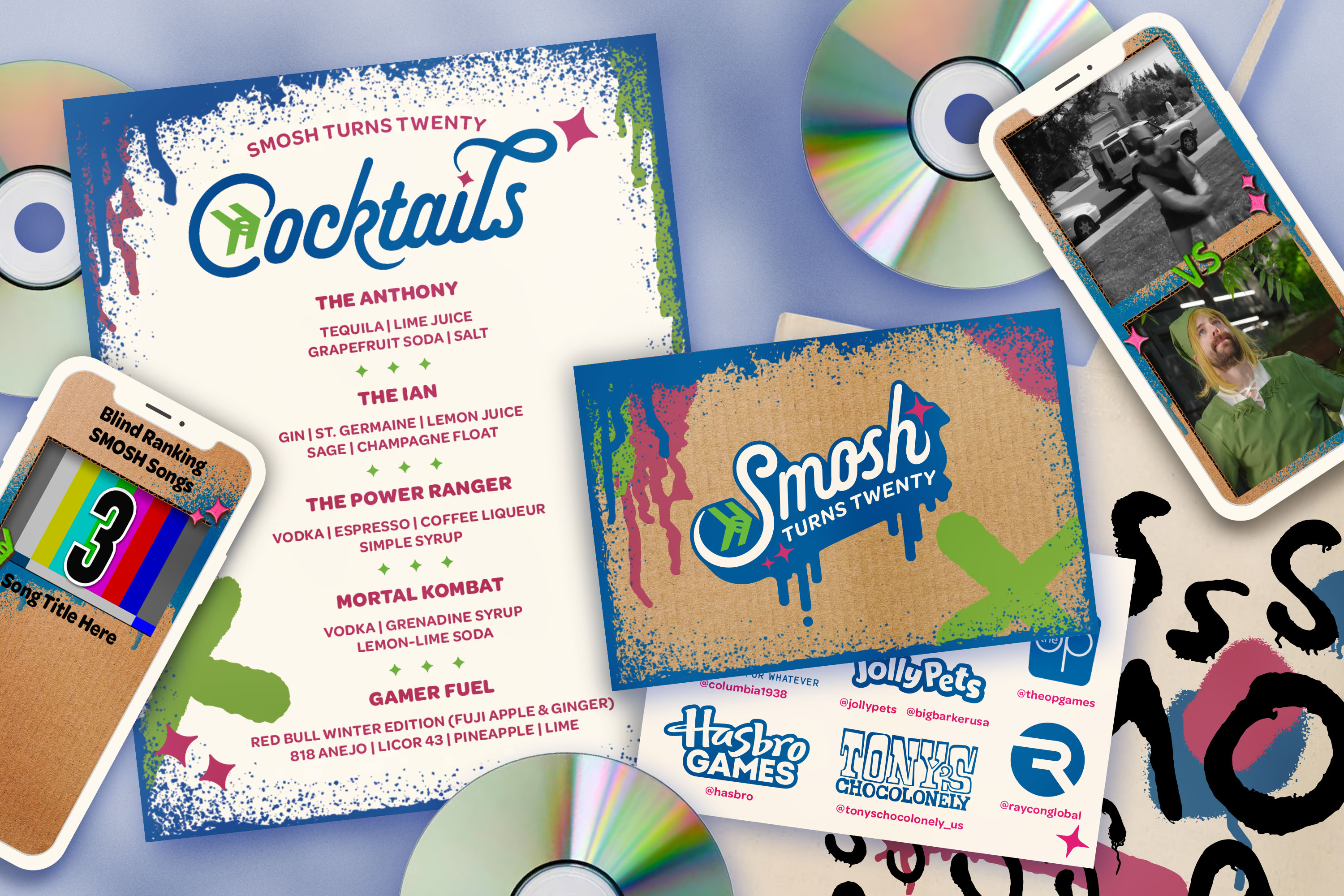
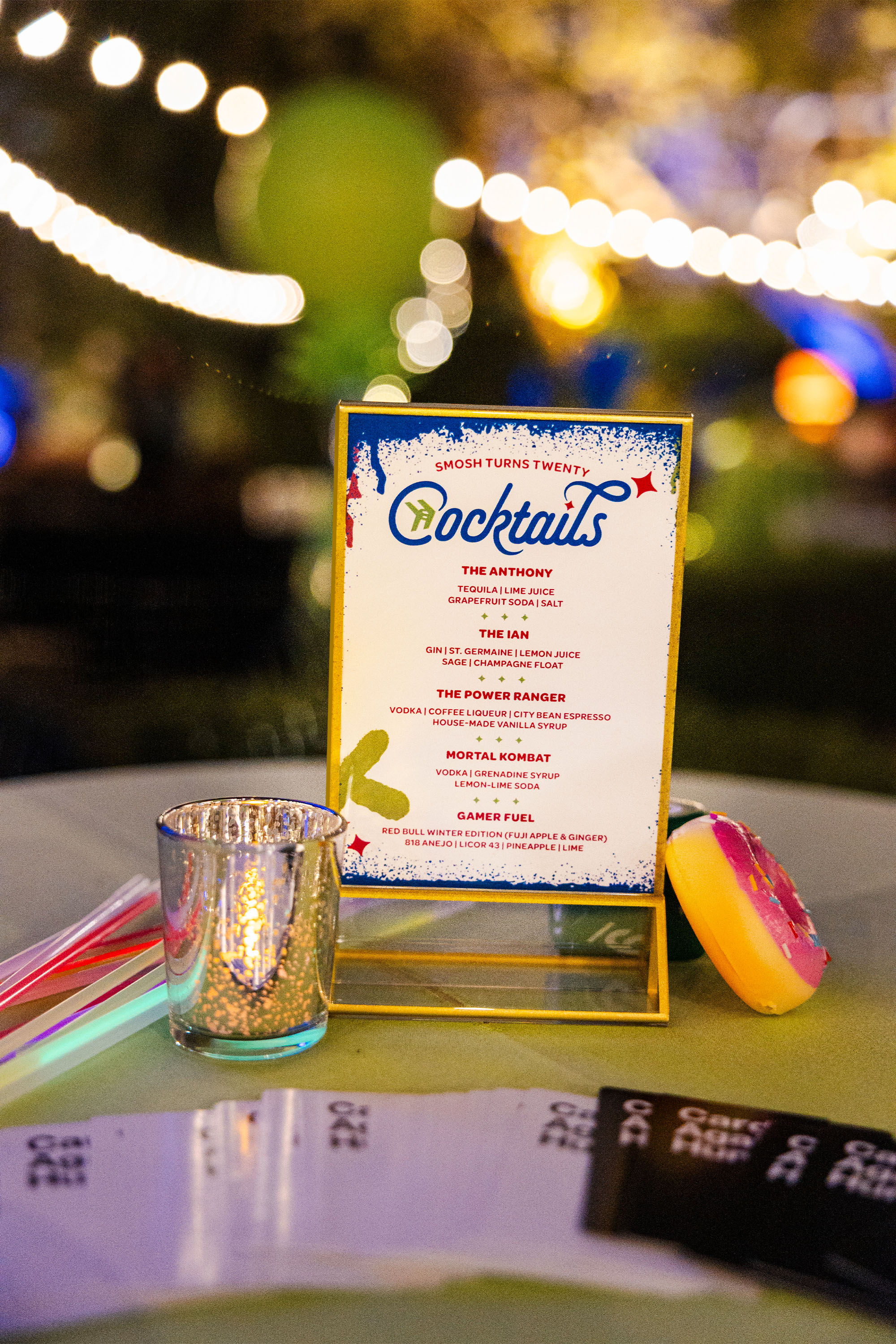
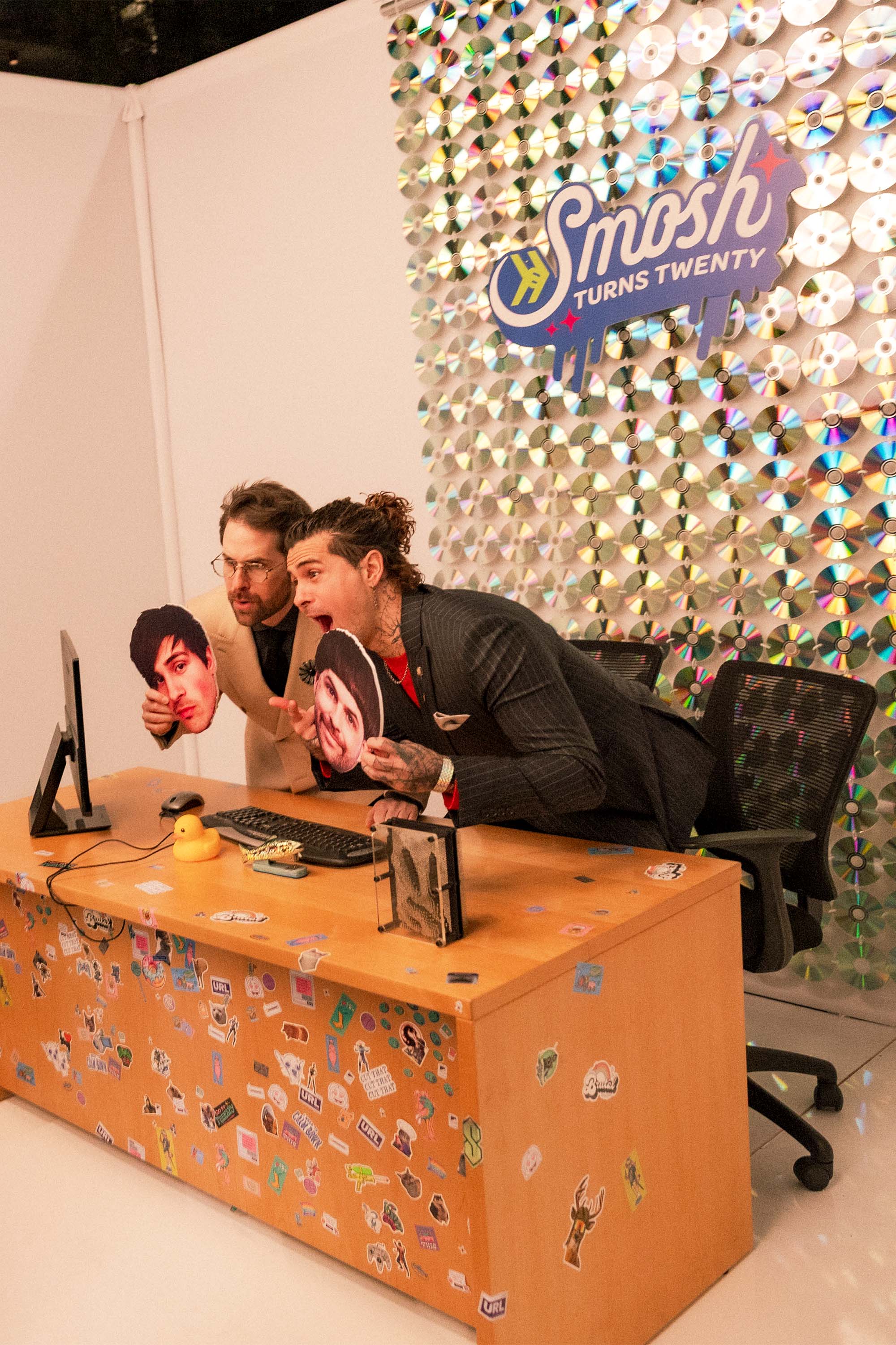
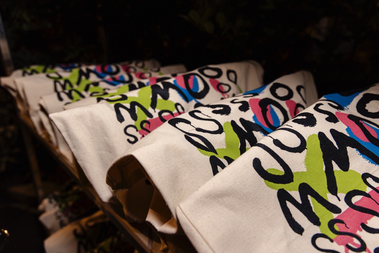
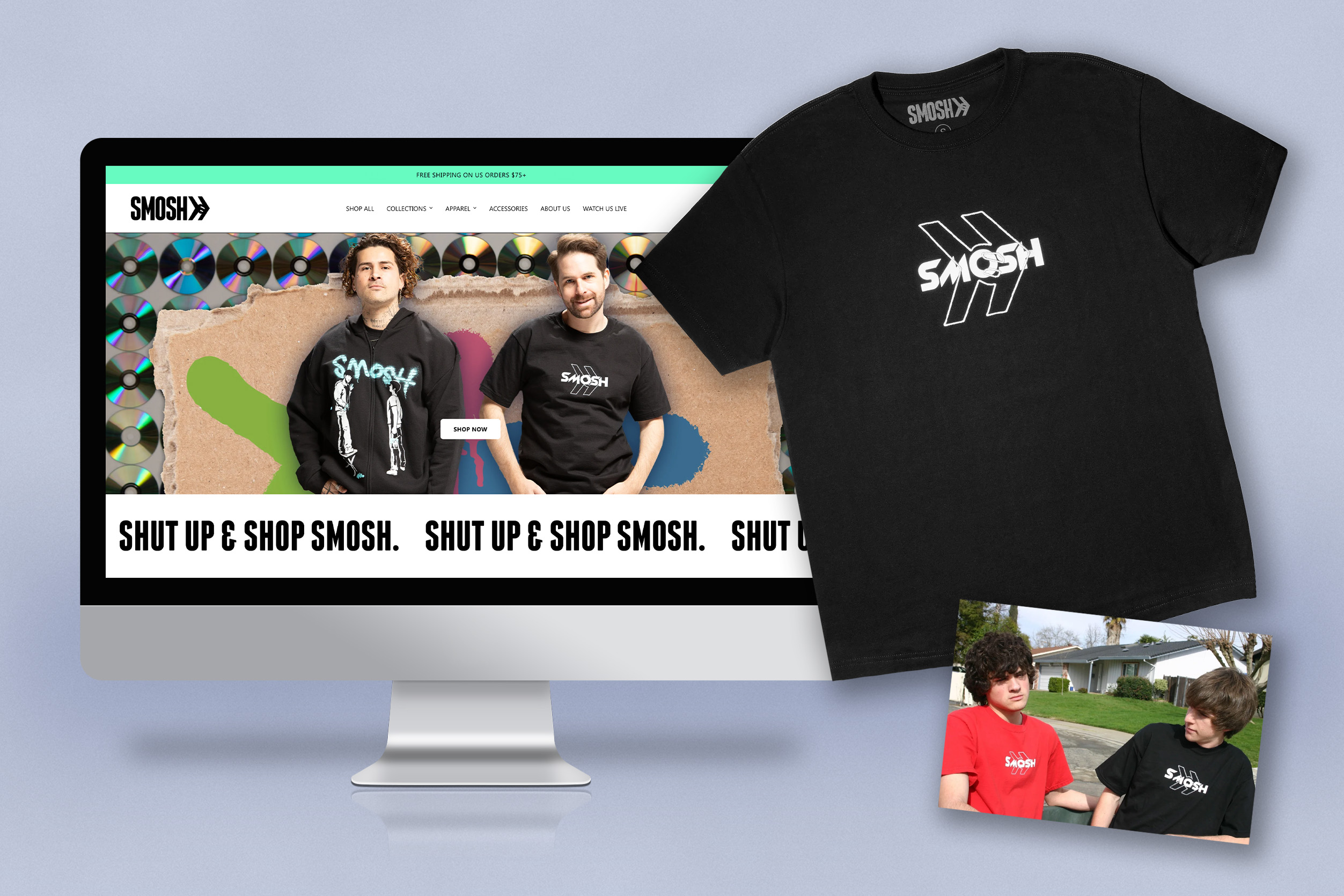
With the logo direction locked, it was such an incredible process to see how the colors and textures took a leading role in the party planning. The final design suite consisted of menus, branded postcards, gift bags, social media templates for celebratory posts, and even the revival of some retro merchandise.


The branding for Smosh's 20th Anniversary was an interesting challenge, because what started as "branding for a party" became a much larger campaign that straddled the social and marketing departments. The final result is a nostalgic suite that honors "old Smosh," but also elevates the old applications to celebrate how much the company has grown and matured over 20 years online.

